On the graphic novel – Alice Kelly in TLS:
‘The overseeing eyes of Doctor T. J. Eckleburg, the Valley of Ashes, Daisy’s voice “full of money”: The Great Gatsby is embedded in the cultural unconscious, and our memories of it are interwoven with the many visual interpretations that already exist, from the disembodied eyes of the first-edition cover to Leonardo DiCaprio endlessly raising his champagne glass in the meme from Baz Luhrmann’s film of 2013. Now that the text is out of copyright, we’re about to get many more reimaginings. Sit down and pour yourself another drink, old sport.
Four recent graphic novels based on The Great Gatsby raise a number of questions about taking on such a familiar story. Can an adaptation take liberties with lines that have been practically learnt by heart? How should a contemporary reworking depict the characters, particularly those who have been ethnically stereotyped? How does one replicate the feeling of this beloved novel visually?’
(…)
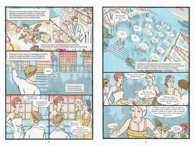
‘The two earlier adaptations are looser, freer. K. Woodman-Maynard’s The Great Gatsby: A graphic novel adaptation from Candlewick Press (240pp, $14.99) is particularly inventive. Her watercolour painting gives the entire book a dreamlike quality. The layout changes often, with regular double-page splashes: characters, emotions and scenes that seem too much for regular panels. Metaphors are visualized literally: the people who “came and went like moths” at Gatsby’s party are winged women; the “broken fragments” of the dinner party punctuated by phone calls from Tom’s mistress are smashed dinner plates, floating in midair; at the end Tom and Daisy walk over a heap of ashes, with the bodies of Gatsby and Myrtle amid the detritus. Woodman-Maynard interweaves the narration into the scenes – on Gatsby’s mansion, on railway platforms, in puddles, wafting through open windows – that make her interpretation feel true to the book, where Nick’s point-of-view colours all that we see.’
(…)
‘Woodman-Maynard removes the Jewish coding from Meyer Wolfsheim; “gonnection” and “Oggsford” become “connection” and “Oxford” – choices the artist defends in her afterword – but the character, usually backlit or in shadow, remains “intimidating and mysterious”. The other adaptations sidestep as much as possible. Morton makes Wolfsheim generically white, while Katz retains “Oggsford”, but deletes all stereotypical visual signifiers. Coelho’s is the only reworking to retain one of four original references to an “expressive nose”. These decisions permit us to wonder: are artists implicated in perpetuating stereotypes if they draw the text accurately? Can you “faithfully” adapt a text while removing its problematic elements?’
(…)
‘Their fascination finds an echo in our own Roaring Twenties moment, when Gatsby’s romantic delusions and unimaginable wealth offer an escape from economic crisis, racial reckoning and post-pandemic grief; when the whisperings and the champagne and the stars are reflected onwards in a hall of ever more revealing, not to say graphic, mirrors.’
Read the article here.
The visual signifiers, yes.
Already two decades ago Coetzee noted in ‘Diary of a Bad Year’ that the word ‘problematic’ has gotten a new, a different meaning. It meant that something was undesirable, was morally wrong.
By using the word ‘problematic’ one can condemn something without becoming the condemner.
‘The problematic’ parts in a novel like ‘The Great Gatsby’ should not be removed. We should stop underestimating the reader.
Whether these parts belong in a rewriting, like a graphic novel, is another question.
The Jewish accent of Meyer Wolfsheim doesn’t bother me. We can survive a tiny bit of anti-Semitism. Or as a Dutch comedian remarked, ‘Nobody ever died from a bit of anti-Semitism.’
In any case, these graphic novels make me want to go back to the original text.